Life Tracking & Data Visualisation Activity
- LEO KAE XUAN

- May 14, 2020
- 1 min read
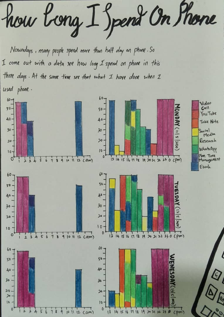
Throughout the life tracking, I had to take note of what time I'm using my phone, what am I doing with my phone from .a.m. to .p.m. After three days of tracking it, I've come up with bar charts and utilized 8 different colours in order to differentiate what I had used when I'm using my phone.
We can see that middle purple pink is video call. It is higest record that I used phone total 5 hours per every single days. Second higest blue colour is ebook. I read ebook
after wake up, before I sleep and after I done my meal.Next,dark green is whatsapp, every evening I spend most of time on whatsapp.
One thing that did'nt go so well is I need to take note that what time I have used phone and what I have done when I used phone. Where normally I should've just proceed with the next thing that I wanted or had to do. It gives me a hassle which is unnecessary if I didn't carry out this tracking session.


Hi Kae Xuan, interesting topic! As discussed over our tutorial session, would be interesting as well to analyse how people of different age group/generation consume/use different types of apps/content on their mobile devices and what does this tell about them as a generation